Geography is All You Need
With the recent launch of Google’s WeatherNext 3 and some incredibly cool research out of Google DeepMind on AlphaEarth, which compresses satellite imagery into a 64-dimensional vector embedding, I’ve been in quite a geographic mood lately!
So I decided to port what I know about elections and geographic coalitions, along with a tremendous amount of data, onto Google’s satellite and AlphaEarth datasets. Also, I really like the graphics that come out of this!
My primary question was how much of a precinct’s partisanship I could infer from satellite imagery compared with other, more detailed datasets, such as economic and demographic inputs.
Some more sentences on the model
AlphaEarth is Google’s foundation model for satellite imagery. It takes each 10x10 (m) square and assigns a 64-dimensional vector; this means two places with similar vectors look similar from space (cosine similarity, for the initiated). I averaged those vectors over precinct polygons, which gives each precinct its own 64-number fingerprint, then trained a gradient boosting-esque model to predict the 2024 Democratic share of the two-party vote.
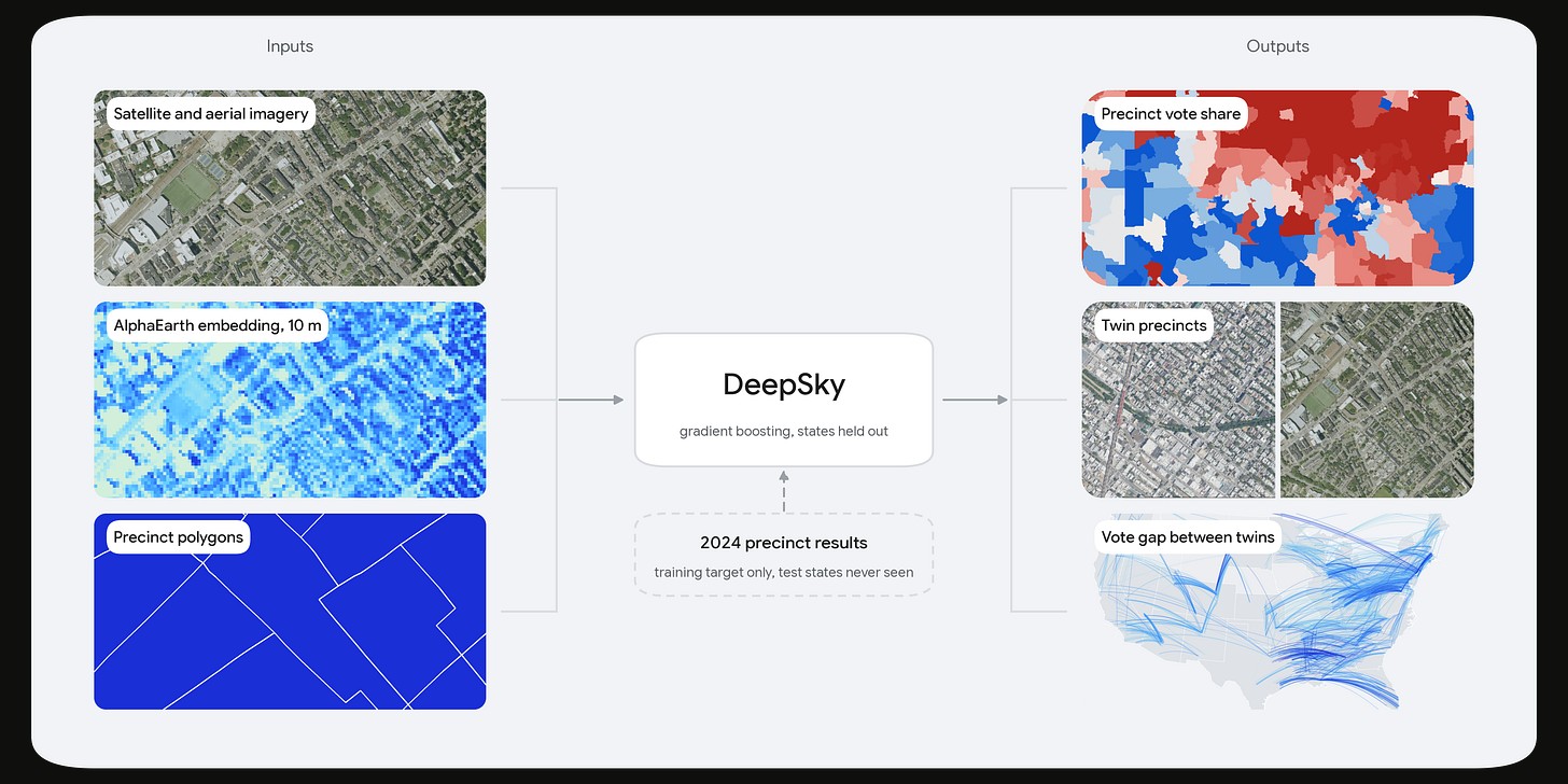
Because Google Cloud is kind of like a casino, and in this analogy I am not a very big player, I don’t get the fun comps like free drinks and luxury treatment (i.e. more data), so I hit the compute limit about a third of the way through. Google being quite cagey with its data leaves me with results for 62,145 precincts across 39 states, but with coverage absent altogether throughout the Plains and Mountain West (who cares about them anyway, east coast/midwest elitism for the win!).
DeepSky (probably) won’t take forecasters’ jobs anytime soon!
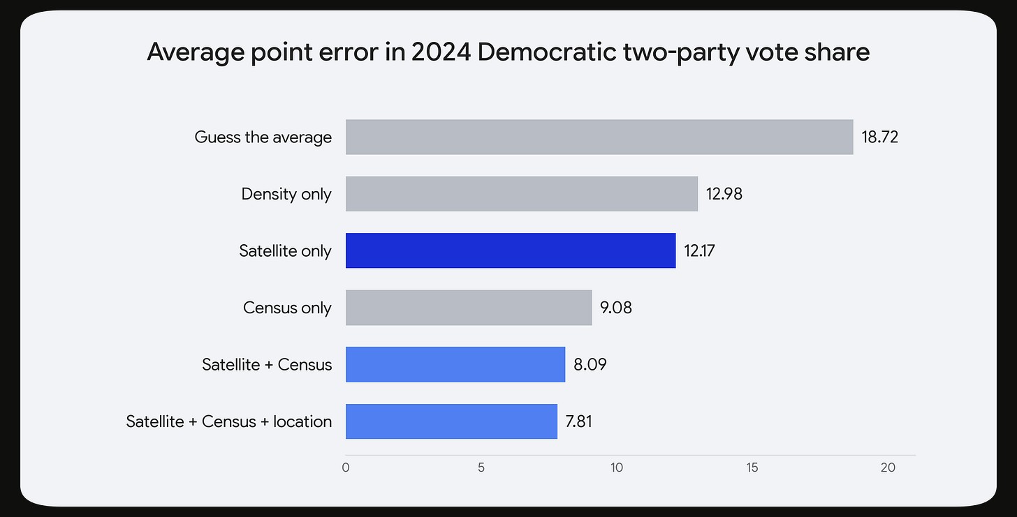
With our gradient boosting model given only the AlphaEarth vector embeddings, it lands within 12.2 points of the real Democratic TPVS (I’m trying to coin this acronym because I don’t like saying two-party vote share all the time) on average, with a correlation of r = 0.70 with the actual results.
That is actually notably better than a 2017 study that used Street View data, mostly the makes and models of parked cars, through 200 cities and reached r = 0.57 at the precinct level by using a deep learning model; cool stuff to do in an afternoon!
However, most of what the model is identifying is density. A model that knows nothing except how many people live per square mile has an MAE of roughly 13.0 points. Hence, the satellite is not particularly informative, at least insofar as we already have the data that it’s picking up at a more granular level.
Given all the census inputs to a model, you can get down to roughly 9.1 points of average error, and adding the embeddings to the census takes it to 8.1, which is a notable and interesting improvement, and a very cool one considering the diminishing returns as you get close to good electoral TPVS predictions.
Some out-of-context satellite wins!
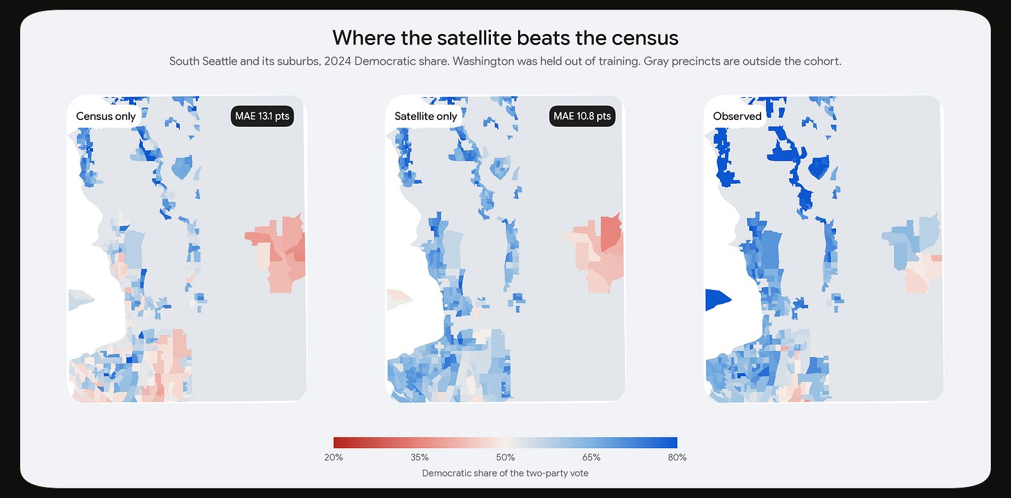
Firstly, if you know the exact chart type that I am ripping from a different paper, then you have some pretty good ball knowledge. Secondly, these are some places where the sky does in fact win, and they’re quite instructive actually.
South of Seattle, in the working-class suburbs along the Green River valley (Kent, Auburn, Federal Way, Tukwila), the census model reads the unique mix of incomes and demographics and calls the area lean-R. In contrast, the satellite sees dense, mixed-use, transit-adjacent development and accurately says that it is quite Democratic. The satellite misses by 10.8 points there, compared with the census’s 13.1. In newer and more diverse suburbs, this geographic information is worth having, especially in places where the census can’t tell the full story of what has happened there since 2020, given that the ACS figures are five-year averages that lag the “ground” for a couple of years at a minimum.
Some very contextual satellite losses
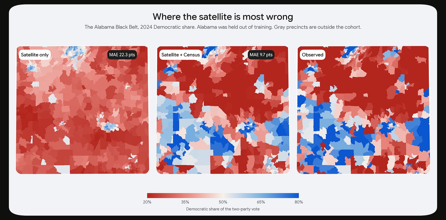
After all that success, I think it is time we humble ourselves, and there is no place in the United States more humbling than the Black Belt. Across central Alabama, the satellite-only model sees a motley mix of pine plantations and pasture and says, “call it a day; this place is red as can be!”, which, in most of the country, would be the correct call!
The truth, as we know quite well from our AP U.S. History classes, is that a band of 70 to 90 percent Democratic precincts runs straight across the state, a circumstance of history and demography that no amount of imagery can or will ever really recover. It is ingrained in the country’s history of slavery and the plantation economy.
As you can see in the images above, the satellite is roughly 22 points off in this area. Adding the census data to the model drops the error to ~10 points, rightly so; the satellite has a hard time detecting a place with significant historical connotations in the United States, a place where people were once forced to live.
“There are two things in life for which we are never truly prepared: twins.” - Josh Billings.
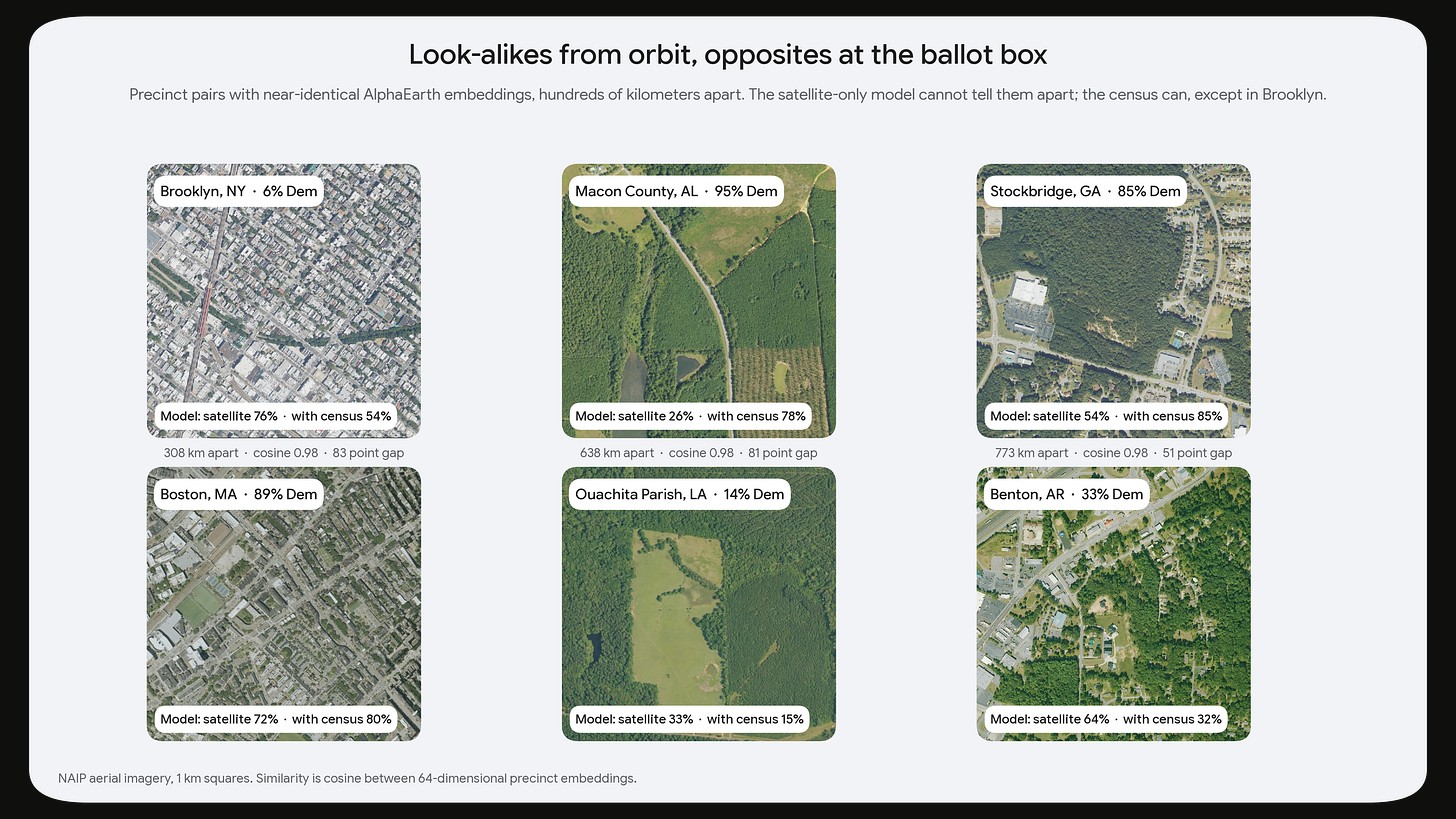
In my opinion, the most fun part of this project was looking at twins.
As you can see above, all of these pairs are near-identical from orbit, at least to Google’s AlphaEarth model. The satellite-only model, faithful to what it sees, gives both members of each pair nearly the same prediction, because, well, that is all it can see!
Adding census data fixes the Southern pair above, Macon County, Alabama and Ouachita Parish, Louisiana, almost entirely, because race is in the census and race (especially % black) is highly correlated with Democratic TPVS; this is also no more apparent than in the rural South, where the polarisation between white and black people is stark.
However, in Brooklyn, an Orthodox Jewish neighbourhood1 that votes 94 percent Republican looks like any other dense Brooklyn neighbourhood to the satellite and, as it turns out, to the census as well (take that demography), which still calls it 54 percent Democratic TPVS. Across all 3,737 twin pairs we have, the two twins are most definitely dizygotic; they vote 16.5 points apart on average, barely closer than the 18.0 points you get by pairing each precinct with a comparable random precinct instead, so maybe geography is just an artifact of the imagination?
Geography is all you need
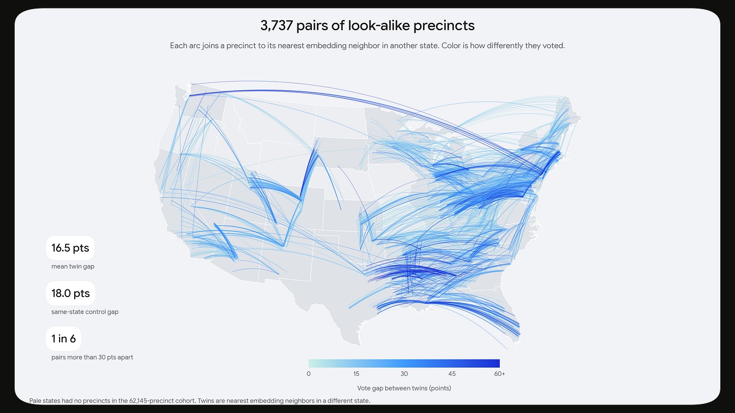
Once the Google Cloud Casino reopens and I can pull more vector embeddings, this map will look much more complete, with more “precinctwins” and spatial data mess than ever.
The more interesting, and far more costly to my very thin pockets, next step is getting away from under Google’s embeddings altogether. AlphaEarth is trained to describe land cover, not politics, and whatever separates Bensonhurst from Boston, if it exists in the imagery at all2, is the kind of feature a general-purpose model rightly has little reason or incentive to keep in its training, where it was optimizing to pull quite different things!
I know, training or RL’ing a proprietary image model to lose to a census spreadsheet is sad, but it sounds like a fun future project.
Most election forecasters know how hard this is; Orthodox Jewish precincts are scattered through neighbourhoods like spices through a dish, and they gave me fits in the Illinois 9th when I forecasted it.
The really interesting thing is nobody really knows the answer to this question. Something latent in the data may be highly predictive, and it would be incredible to find!